Cherry Coke
Brand Identity • Package Design
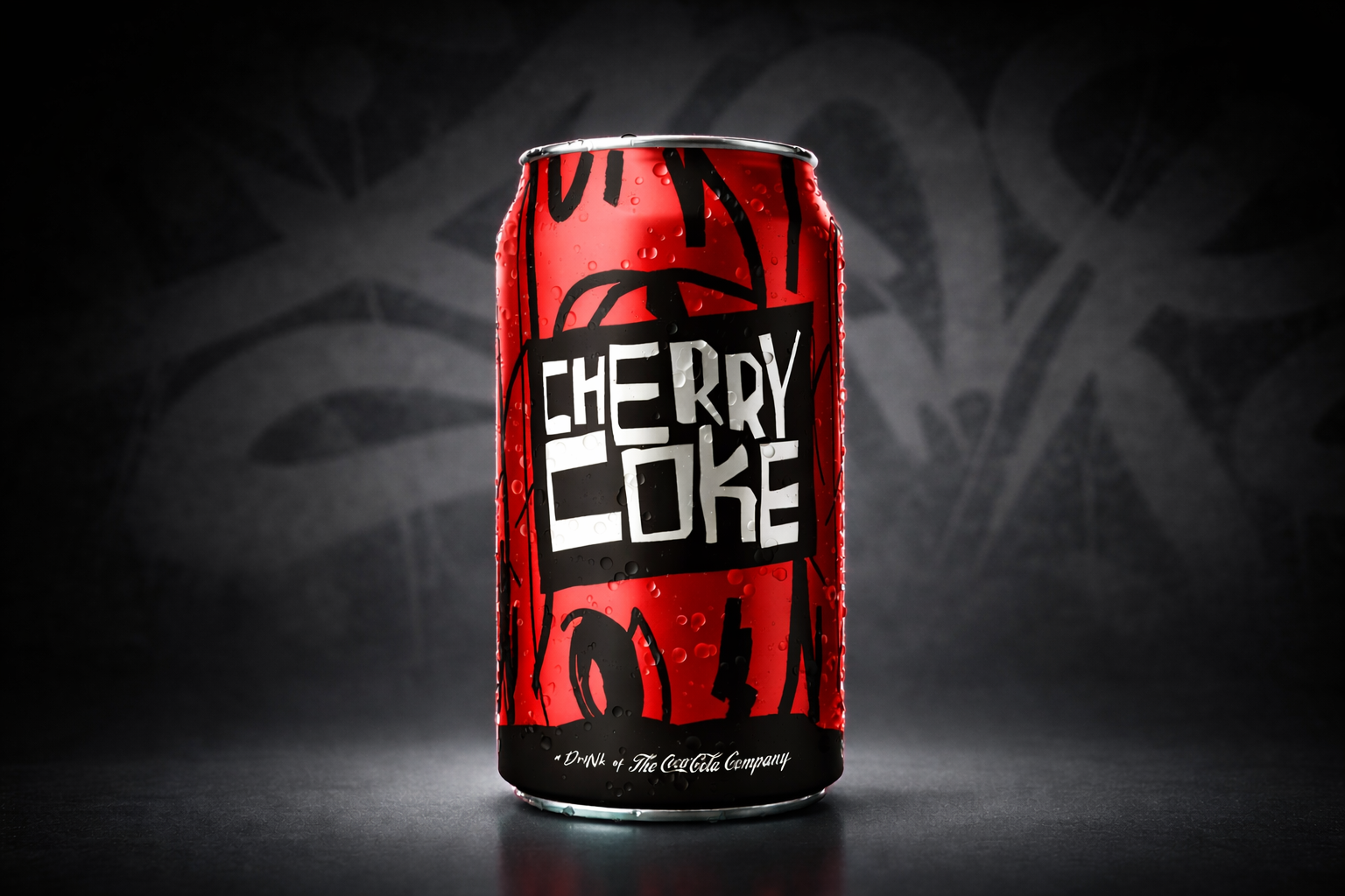
The Cherry Coke brand identity drew from 90s youth culture, graffiti, skateboarding, grunge, and punk,
to capture the raw energy and rebellious spirit of the era. Working as a designer at The Coca-Cola Company, I collaborated with the Marketing department to understand our target audience and before designing the identity that went on to reach a global market. Steering clear of traditional brand elements, I hand-drew the brand name letterforms and created a custom, hand-lettered font to complement the energetic graphic pattern,
all reflecting the music and street culture of the time.
to capture the raw energy and rebellious spirit of the era. Working as a designer at The Coca-Cola Company, I collaborated with the Marketing department to understand our target audience and before designing the identity that went on to reach a global market. Steering clear of traditional brand elements, I hand-drew the brand name letterforms and created a custom, hand-lettered font to complement the energetic graphic pattern,
all reflecting the music and street culture of the time.
Fresca
Brand Identity • Package Design
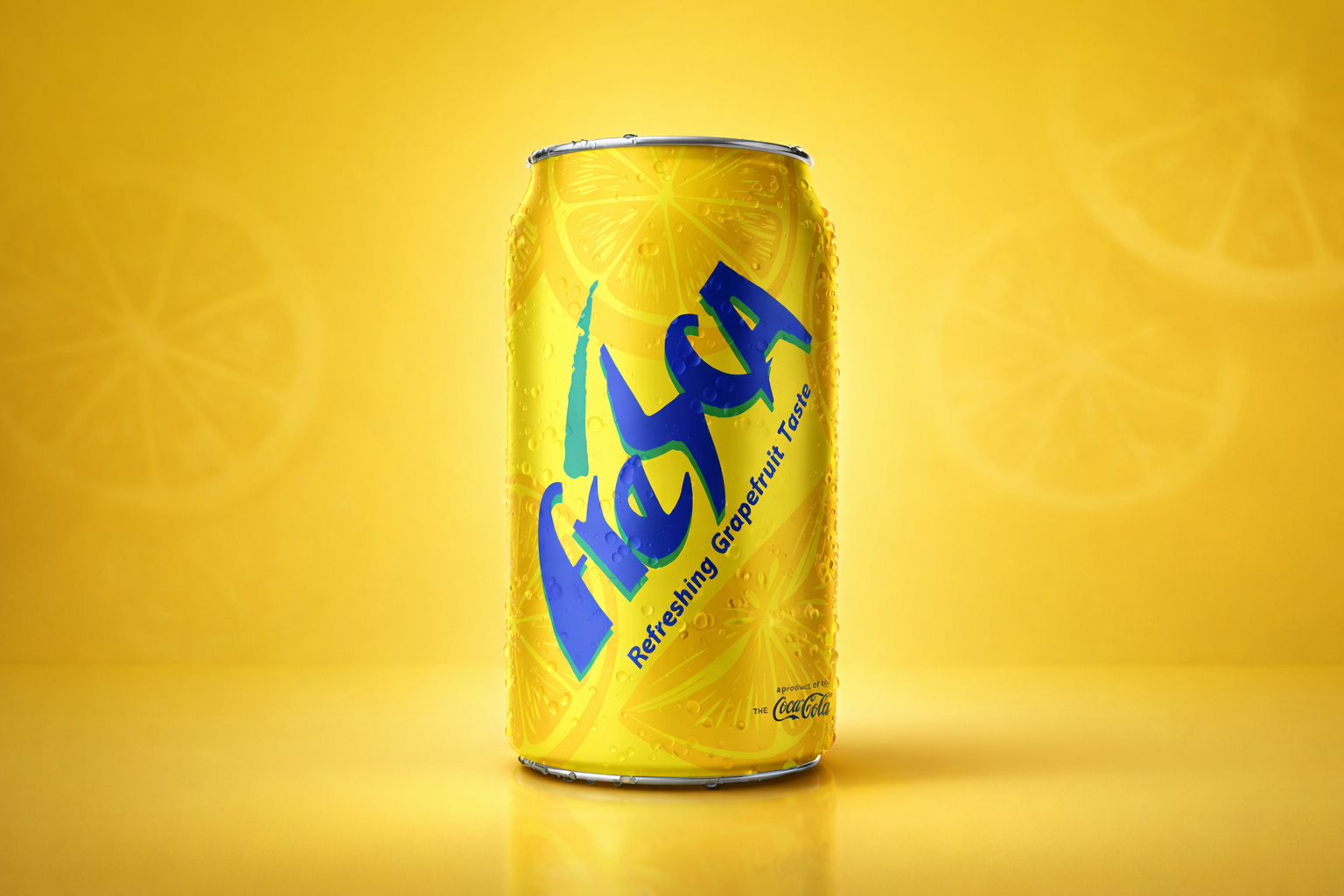
Fresca is a grapefruit-flavored soft drink enjoyed across a wide range of global markets. To appeal to Latin American consumers—where fruit-flavored beverages are a cultural staple—Coca-Cola’s marketing team sought a new, targeted brand identity and packaging. The result was a vibrant, hand-drawn design featuring stylized grapefruit imagery and a playful purple-and-green logo mark. The fresh, energetic look resonated strongly with Latin American audiences and was so successful that it was later launched in Mexico, South Africa, and other international markets.
Powerade
Brand Identity • Package Design
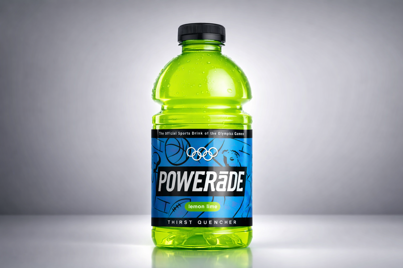
The Powerade brand was in need of a refresh. My aim with the design was to capture a gritty realism inspired by street basketball, football, soccer, and track. The goal was to connect with everyday athletes, not just elite professionals. Tested extensively against competing packages, this design consistently came out on top in focus groups. Stylized athlete illustrations set against a brick wall pattern evoked the energy of street graffiti. A bold black badge for the logo, paired with a matching black cap, created a striking contrast with the white
lettering, a powerful combination rarely seen in sports drinks at the time.
lettering, a powerful combination rarely seen in sports drinks at the time.
Hi-C
Brand Identity • Package Design
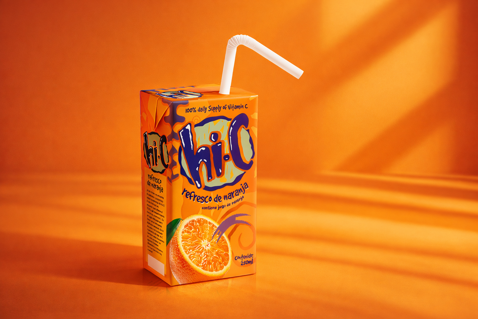
Since its debut in 1947, Hi-C has been a favorite kids’ juice brand. Coca-Cola acquired the brand in 1960 and in
the 90s sought to refresh its identity for the Latin American youth market, while maintaining trust of parents. Starting with a playful, hand-drawn logo, I used vivid, flavorful colors and whimsical elements that speak directly to young consumers in the design. At the same time, realistic fruit imagery and clear messaging about real juice content and 100% daily supply of vitamin C reassure gatekeepers that while Hi-C is fun, it’s also wholesome.
the 90s sought to refresh its identity for the Latin American youth market, while maintaining trust of parents. Starting with a playful, hand-drawn logo, I used vivid, flavorful colors and whimsical elements that speak directly to young consumers in the design. At the same time, realistic fruit imagery and clear messaging about real juice content and 100% daily supply of vitamin C reassure gatekeepers that while Hi-C is fun, it’s also wholesome.
Bolt Bottle
Package Design • Industrial Design
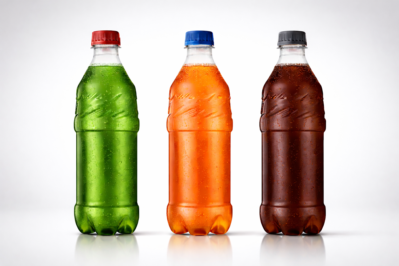
Following the success of the Cherry Coke redesign, Coca-Cola’s marketing team wanted a proprietary bottle for their youth brands. Until that point, plastic bottles were largely generic. The brief called for something edgy and youth-oriented within the constraints of plastic molding technology. Two ideas drove the solution: attitude and grip. Like bolts of lightning, a jagged band wraps the upper portion giving the bottle its energy and its name. Below that, a grip area accommodates most hands, making the bottle easy to hold. Working closely with Coca-Cola’s package development team, the concept was translated into a 3D design that has since been used across multiple brands including Cherry Coke, Surge, and Fanta, as well as numerous international brands, and is still in use today.
Diet Coke Gold
Brand Identity • Package Design
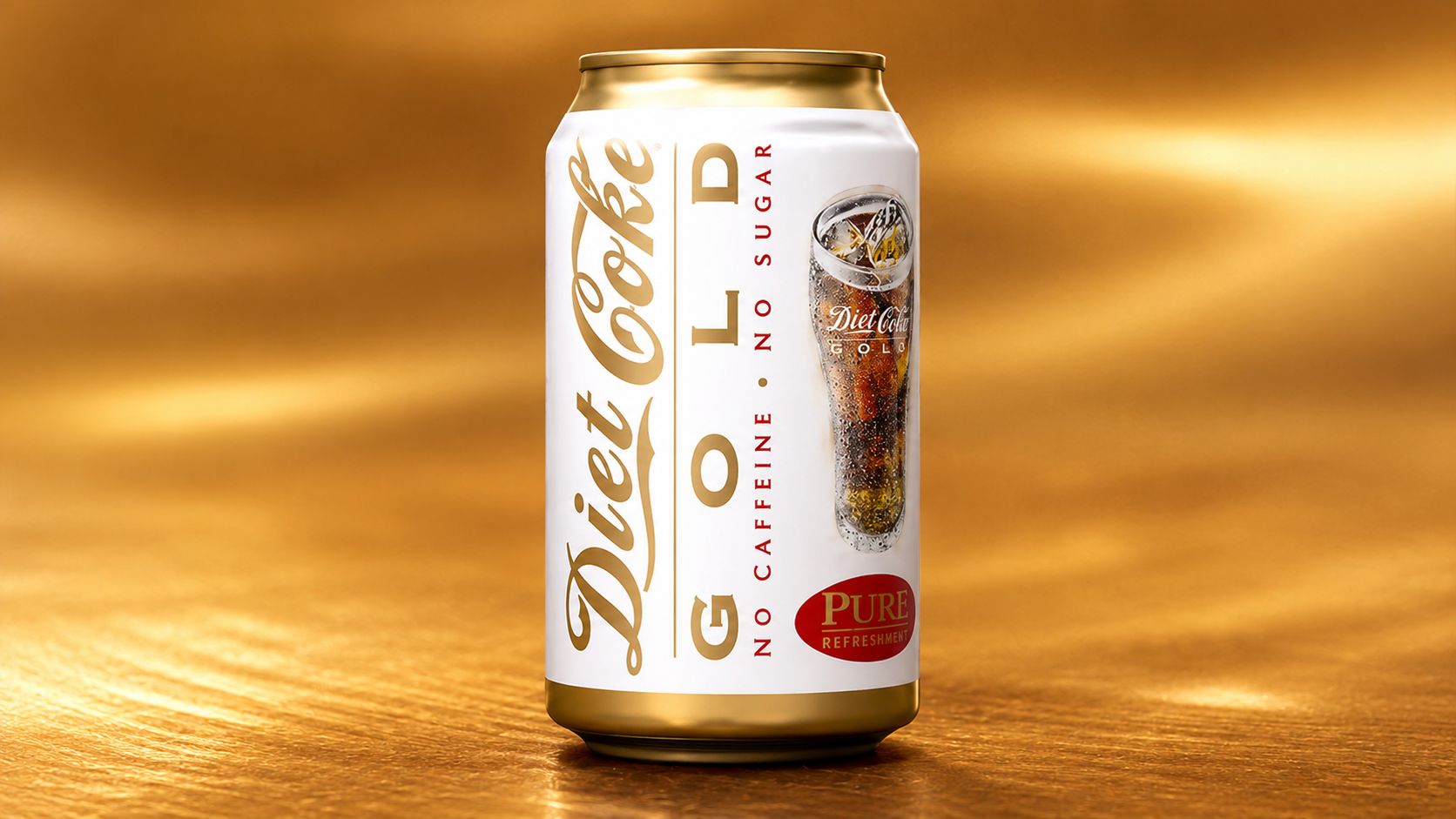
Developed as an exploratory naming and packaging concept for Caffeine-Free Diet Coke, Diet Coke Gold was tested across multiple consumer focus groups. This design consistently ranked as the strongest option, though the company ultimately decided to retain the existing product name.
Radio Cola
Brand Identity • Package Design
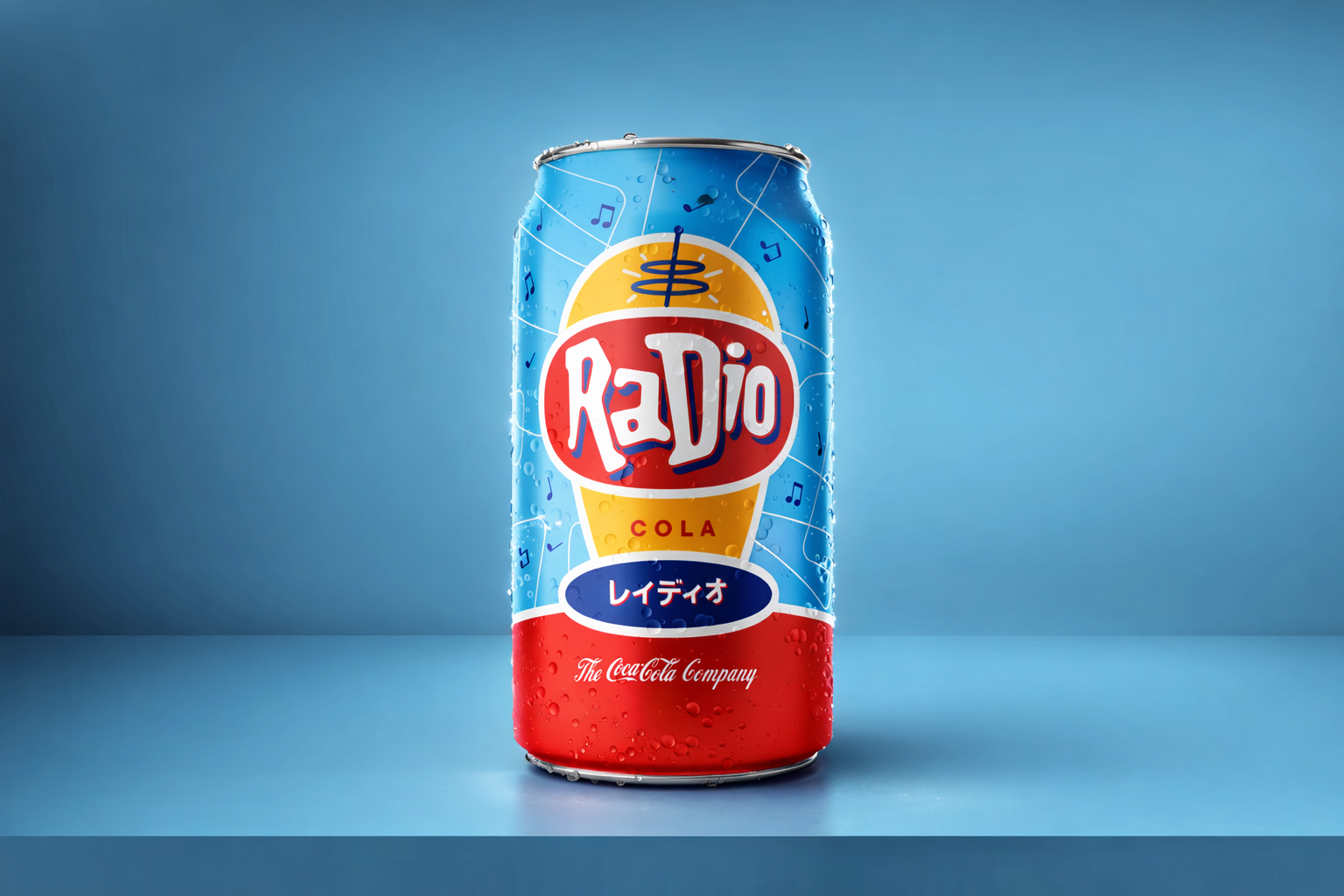
Designed for the Japanese market, this cola with a hint of lemon flavor needed a brand refresh. This whimsical, brightly-colored, retro-styled design was selected by focus groups amid multiple contenders.
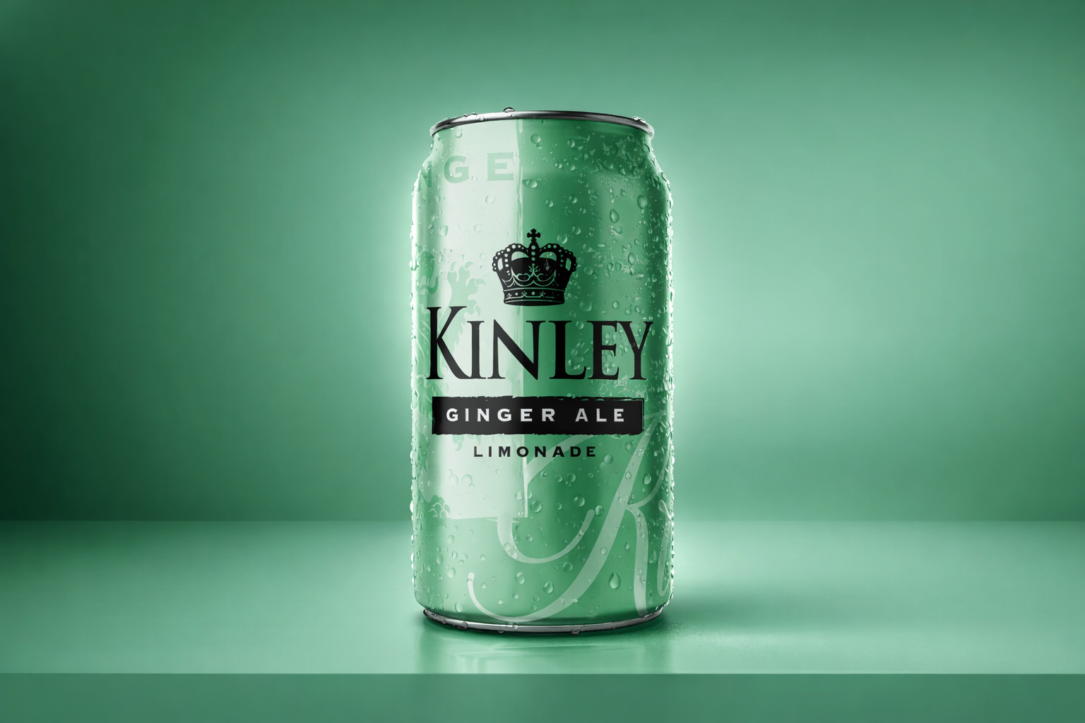
Kinley
Brand Identity • Package Design
A sophisticated Ginger Ale for the German market. Coca-Cola wanted a brand refresh that was more up-to-date.
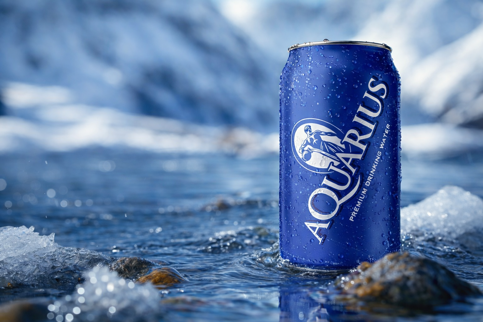
Aquarius
Brand Identity • Package Design
Aquarius is an international bottled water product of the Coca-Cola Company. Designed specifically
for the South Pacific market, the brand identity combined a classical, serif font, and the Aquarius, water-bearer
icon on a map of the constellations.
for the South Pacific market, the brand identity combined a classical, serif font, and the Aquarius, water-bearer
icon on a map of the constellations.
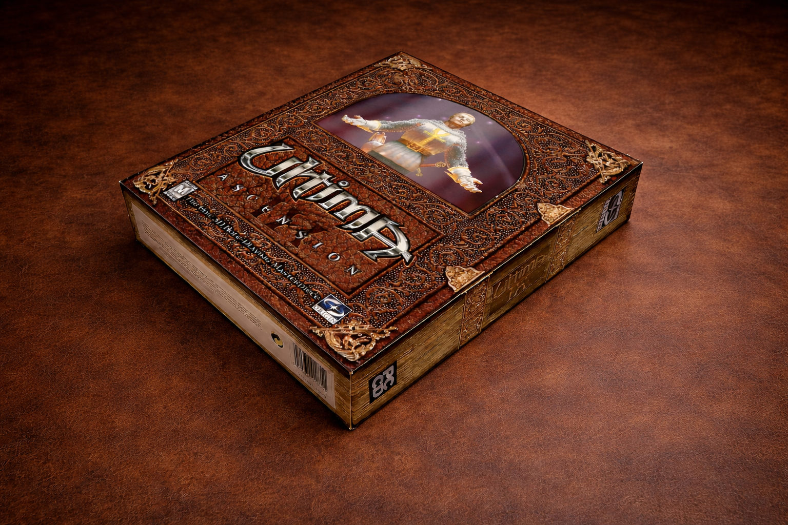
Ultima Ascension IX
Brand Identity • Package Design
Ultima is one of the most celebrated role-playing game series in the history of personal computing. For its
ninth and final installment, Origin Systems, a subsidiary of Electronic Arts, wanted packaging that honored that legacy with the feel of an ancient leather-bound book. I also redesigned the Ultima wordmark using custom medieval letterforms, sharp, metallic, and blade-like. Ultima IX shipped in 1999 to praise for its groundbreaking graphics and immersive original score, and the package was designed to match that ambition.
ninth and final installment, Origin Systems, a subsidiary of Electronic Arts, wanted packaging that honored that legacy with the feel of an ancient leather-bound book. I also redesigned the Ultima wordmark using custom medieval letterforms, sharp, metallic, and blade-like. Ultima IX shipped in 1999 to praise for its groundbreaking graphics and immersive original score, and the package was designed to match that ambition.
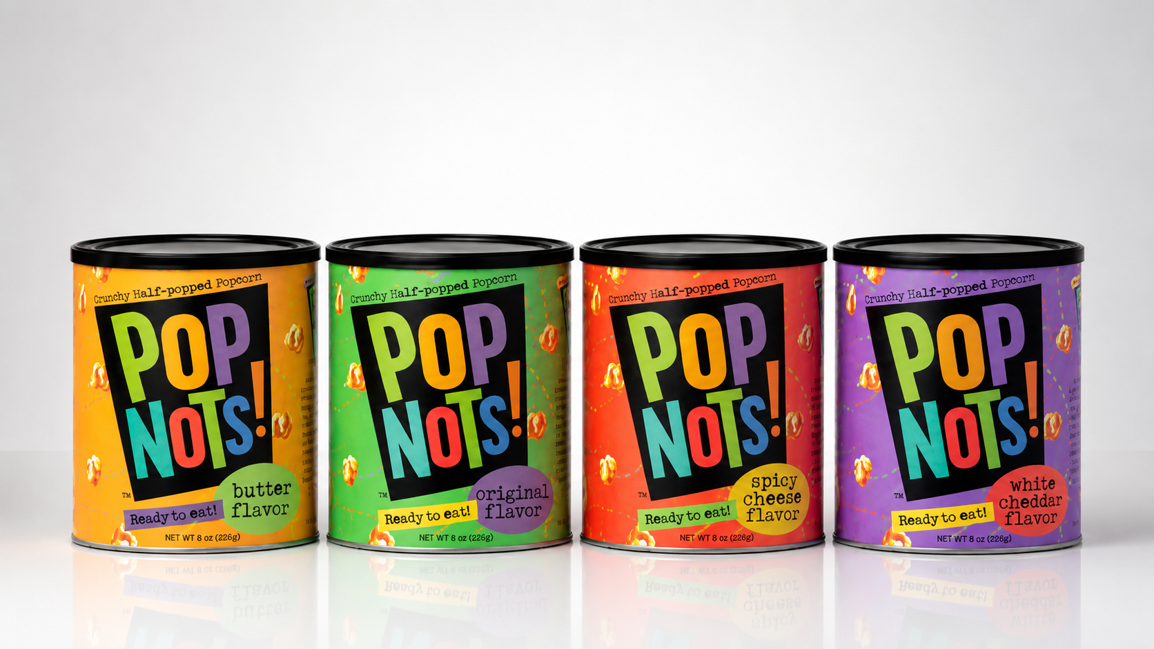
PopNots
Brand Identity • Package Design
Pop Nots was brought to market as a snack made from partially popped popcorn kernels. I conducted
informal street testing to evaluate the packaging, and this design emerged as the clear favorite. Although the product launched, it ultimately struggled because some of the kernels remained too hard to eat comfortably.
informal street testing to evaluate the packaging, and this design emerged as the clear favorite. Although the product launched, it ultimately struggled because some of the kernels remained too hard to eat comfortably.
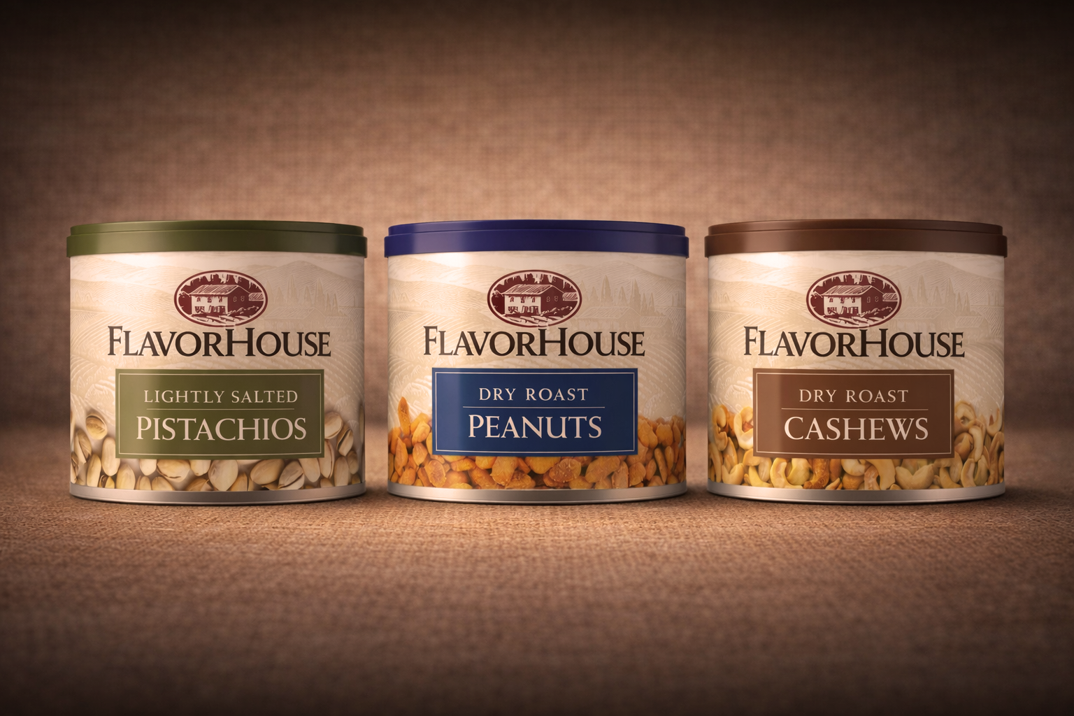
Flavorhouse
Brand Identity • Package Design
FlavorHouse spent years trying to compete with Planters on Planters’ terms. Heavy, dark, and undifferentiated,
their packaging offered consumers little help navigating the shelf. I started with a redesign of the logo, centering it on an engraved farmhouse illustration that gave the brand an artisanal, premium quality. A warm cream label, color-coded lids and variety badges for each SKU made navigation more immediate and intuitive. Photography of the nut varieties wrapping the base of each can kept the product front and center. The result was a packaging
system that was both cohesive and easy to shop, repositioning.
their packaging offered consumers little help navigating the shelf. I started with a redesign of the logo, centering it on an engraved farmhouse illustration that gave the brand an artisanal, premium quality. A warm cream label, color-coded lids and variety badges for each SKU made navigation more immediate and intuitive. Photography of the nut varieties wrapping the base of each can kept the product front and center. The result was a packaging
system that was both cohesive and easy to shop, repositioning.